Caddie Companion
Scope
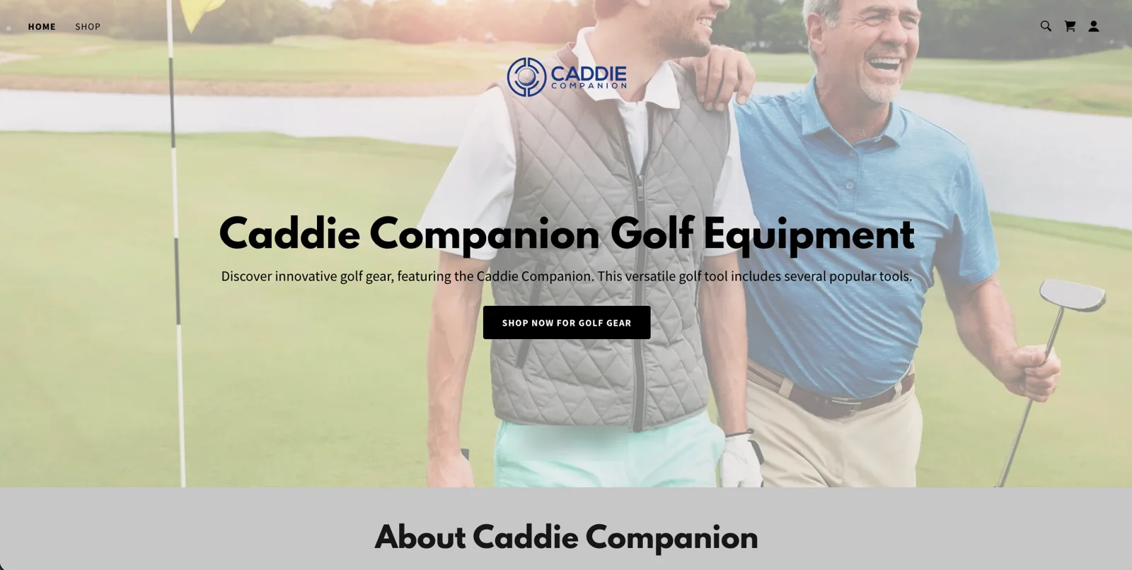
Caddie Companion makes a six-in-one golf multi-tool, sold online for $49 and promoted through paid ads. The tool itself is well made, but the store it was selling from was a slow GoDaddy template that never really explained what the tool does or why a golfer would want one in their pocket.
We rebuilt the store from the ground up in two and a half weeks, then stayed close to the owner for six weeks after launch, testing and adjusting things while the ads ran. The new store turns 21% more of its visitors into buyers, which gave the owner the confidence to scale up his ads.
- Store redesign
- Headless Shopify build
- 3D product viewer
- Conversion optimization
- Launch and ad support
+21%
More visitors turned into buyers
6 weeks
Of hands-on tuning after launch
2.5 weeks
From kickoff to a live store
The Mission
Get the store to sell the tool.
The old store had a well-made product behind it but did very little to sell it, and too many visitors left before they understood what the tool actually does. The goal was to make the store clear enough that a golfer gets it within a few seconds of landing, and to make it convert well enough that the owner could confidently spend more on ads, then keep improving it once real buyers started coming through.
Solution · 01
Make the store explain the tool as well as the owner does.
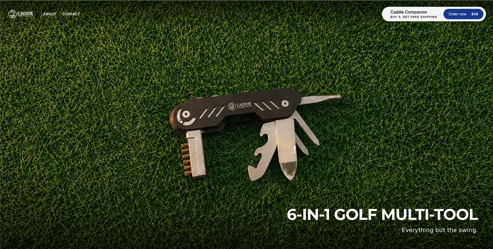
A six-in-one tool is hard to picture from a single photo, and people rarely buy something they can't quite picture. We built an interactive 3D model that takes the tool apart as you scroll, then walked through all six tools one at a time, so a golfer knows exactly what they're getting within a few seconds of landing. New product video and photography did the rest.

Because the store only sells one product, we left out the usual product grid and add-to-cart step entirely. An order button with the price and the free shipping offer stays pinned to the top of the screen on every page, so a golfer can buy the moment they're convinced, wherever they are on the page.
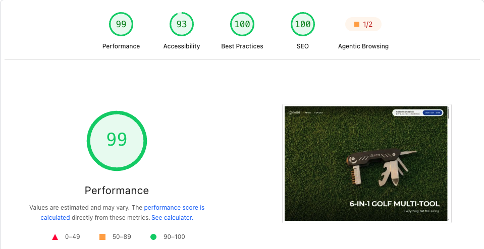
We also rebuilt the store to load quickly, since a slow page quietly undoes all of that. It went from scoring around 30 on PageSpeed to 99, with Shopify still handling products, checkout and orders behind the scenes, so the owner manages everything from the same Shopify admin he already knew.
PageSpeed · caddiecompanion.com
Solution · 02
Give buyers a reason to trust a brand they've never heard of.
Most people landing on the store had never heard of Caddie Companion, so once they understood the tool, the next thing they needed was a reason to believe in it. We went through the owner's footage and photos and put the best of it where buyers actually look: short clips of the tool in use on the course, real photos of golfers using it, and verified reviews placed right next to the order button.
Solution · 03
Stay on after launch to keep improving it.
Launch day is when a store finally meets real buyers, so that's when we paid the closest attention. For six weeks after launch, we worked alongside the owner, helped him build and audit his ads as he scaled them up, and kept adjusting the store based on how visitors were actually buying.
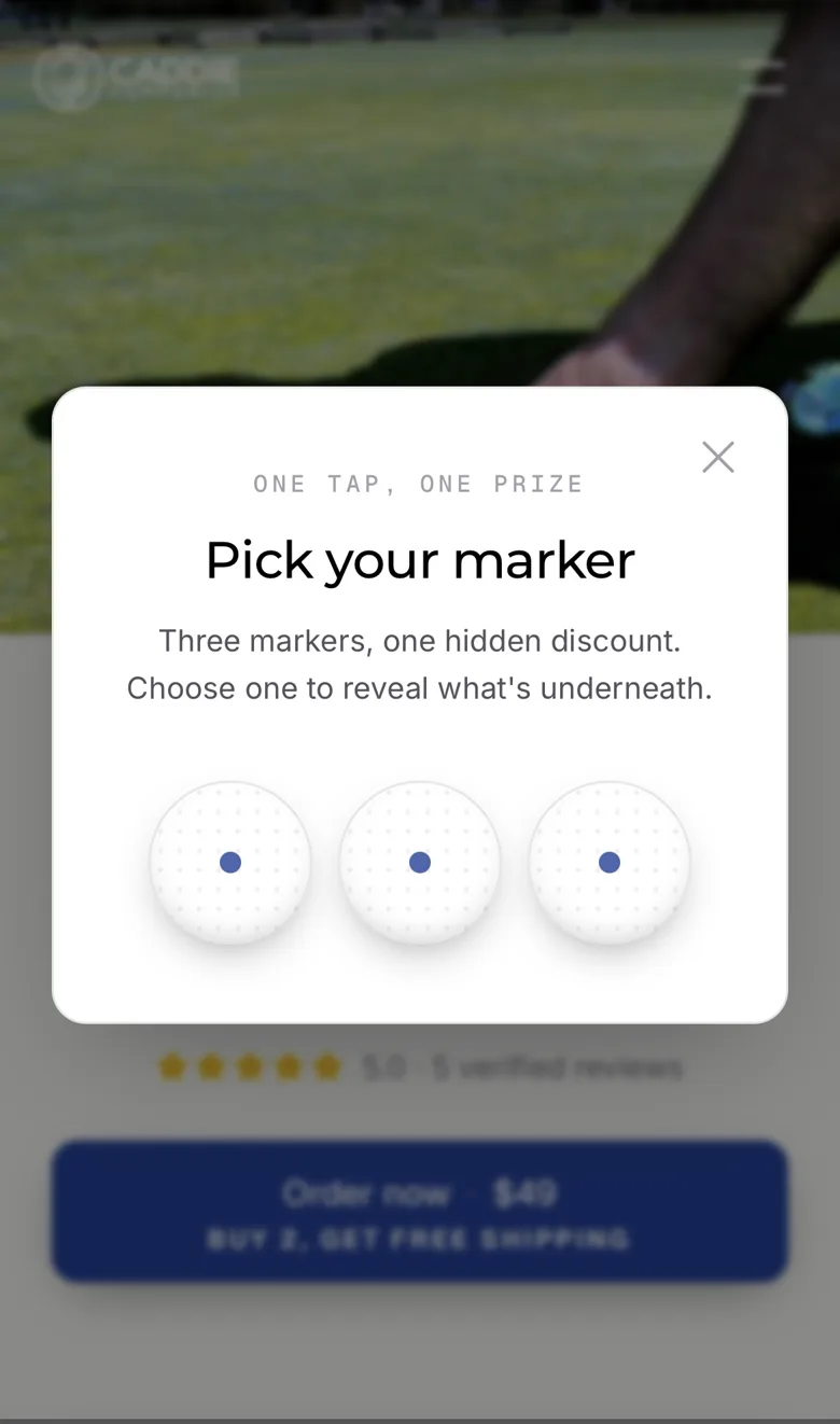
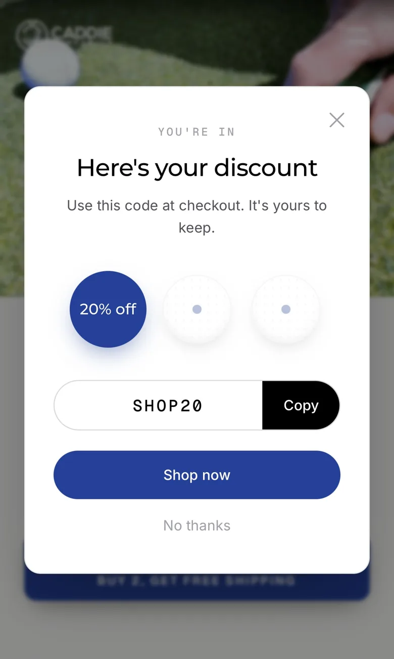
The change that stood out was a discount you play for.
Instead of a plain discount banner, first-time visitors pick one of three ball markers to reveal their code. It only takes one tap and it fits the product, and more than a quarter of visitors now play it. About half of all orders come through with a code from it.
A/B testing. We tested different versions of the store against each other on live traffic and kept whichever one sold more.
Bundles and upsells. We added a buy-two offer with free shipping and suggested add-ons at the right moment, so more orders include more than one tool.
Want to know where your store is losing buyers?
Send us your site and we'll show you what we'd change first.
The Result
From kickoff to today.
- Kickoff
- We had one call with the owner to understand the product and the people buying it. From there, most of the work was on our side.
- Launch
- We launched the new store two and a half weeks after kickoff.
- Next 6 weeks
- We tested different versions of the store, added bundles and the marker pop-up, and helped build and audit his ads as he scaled them up.
- Today
- The store turns 21% more of its visitors into buyers, and the owner has scaled up his ads with confidence. We still hop on a call whenever he needs a hand.
Reflection
The work that mattered most happened after launch.
A clear, well-made store is what earns the first sale, but what kept the conversion rate climbing was staying close once real buyers arrived. Watching how people actually used the store, testing small changes and adjusting things alongside the owner as he grew his ads is where a lot of the gain came from, and it's the part of the work most stores never get.
Next move